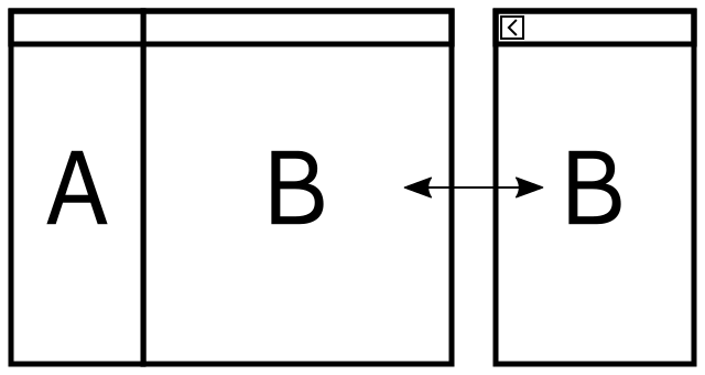
As some of you may already know, I recently joined Purism to help developing GTK+ apps for the upcoming Librem 5 phone. Purism and GNOME share a lot of ideas and values, so the GNOME HIG and GNOME apps are what we will focus on primarily: we will do all we can to not fork nor to reinvent the wheel but to help allowing existing GTK+ applications to work on phones.
How Fit are Existing GTK+ Apps?
Phones are very different from laptops and even tablets: their screen is very small and their main input method is a single thumb on a touchscreen. Luckily, many GNOME applications are touch-friendly and are fit for small screens. Many applications present you a tree of information you can browse and I see two main layouts used by for GNOME applications to let you navigate it.
A first kind of layout is found in applications like Documents, I’ll call it stack UI: it uses all the available space to display the collection of information sources (in that case, documents), clicking an element from the collection will focus on it, displaying its content stacked on top of the collection and letting you go back to the collection with a Back button. Applications sporting this layout are the most phone-enabled ones as phone apps typical following a similar layout. Some polish may be needed to make them shine on a phone but overall not so much. Other applications using this layout are Music, Videos, Games, Boxes…
A second kind of layout is found in applications like Contacts, I’ll call it panel UI: it displays all the levels of information side-by-side in panels: the closer the information is from the left, the closer it is from the root, each selected node of the information tree being highlighted. This is nice if you have enough window space to display all this information and focus on the leaves isn’t required by the user as it allows to quickly jump to other elements of the collection. Unfortunately window space is rare on phones, so these applications would need to be adjusted to fit their screens. Other applications using this layout are Settings, Geary, Polari, FeedReader…
Of course, other layouts exist and are used, but I won’t cover these here.
Stack UIs respond to size changes by displaying more or less of the current level of information, but panel UIs tend to seemingly arbitrarily limit the minimum size of the window to keep displaying all the levels information, even though some may not be needed. The responsibility of handling the layout ans sizes to display more or less of some levels of information is sometimes offloaded to the user via the usage of GtkPanel, who then has to manually adjust which information to hide or to display by changing the width of columns every time they need access to another information or when the window’s size changes. A notable example of hurtful GtkPanel usage is Geary, which can be a bit of a pain to use half-maximized on a 1920×1080 screen.
Responsive GTK+ Apps
Panel UIs need to be smarter and should decide depending on the window’s size which information is relevant to the user and should be displayed. As we don’t want to replace the current experience but to extend it, the UIs need to respond to window size changes and explicit focus change requests.
One way of doing it would be to stack the panels one on top of the other to show only one at a time, adding extra Back buttons as needed, effectively switching the UI between panels and a stack.

Another one would be to have floating panels like on KDE Discover. I am not a fan of this method, but on the other hand I’m not a designer.
I expect that to make applications like Geary easier to use even on laptops.
Implementing GtkResponsiveBox
I will try to implement a widget I call GtkResponsiveBox. It contains two children displayed side by side when the box’s size is above a given threshold and only one of them when the size is below it.
I expect this widget to look like a weird mix of GtkPaned and GtkStack, to be orientable and to have the following sizes:
- minimal size = max (widget 1 minimal size, widget 2 minimal size)
- natural size = widget 1 natural size + widget 2 natural size
- threshold size = widget 1 minimal size + widget 2 minimal size
I am not completely sure yet how to implement it nor if this widget is a good idea overall. Don’t expect anything working soon as it’s the first time I subclass GtkContainer. I’ll let you know how implementing the widget goes, but in the meantime any comment is welcome!
Thanks Philip for your guide detailing how to implement a custom container, it helps me a lot!